dbSEABED 
  Examples of Gridded Maps

Contents

IDW Nearest Neighbours Interpolation
IDW Fixed Radius Interpolation
Nearest Neighbour Gridding
Voronoi Polygon Interpolation
Triangulations
Dominance Grids
Return to Visualizations


Introduction

Grids are probably the most useful form of output for the end-user. They are succinct, take almost no effort to understand, are easily manipulated in a GIS and perform well as inputs to numerical models. They are very well suited for use in offshore planning and feasibility studies. They can be sent as grids, gridded points or polygon coverages.

Grids resolve the difficult issue of multiple data items per sample site (such as dual core + photo investigations; description + analysis of same sample) ; in point plots which of these data items shows on top depends on the internal machinations of the chosen GIS; but only one item can be seen at a time. Gridding allows a consensus such as the average, median, maximum, minimum, etc.

Top of page


IDW Nearest Neighbour Interpolation ****
 
This is probably the best depiction of physical parameters where abundant data is available and complete coverage of the map area is required. 

After loading the point dataset (ALL, EXT, PRS or CLC, see the points) and selecting by query the points with data, the grid is created in ArcView/Spatial Analyst using <Surface/InterpolateGrid/ OutPutGridExtent=[BoxFile]/OutputGridCellSize=[0.01deg]/OK /IDW/ZValueField=[Grainsize]/NearestNeighbours/NoOfNeighbours=[3]/OK>.

Before doing the gridding be sure to set the View properties to degrees coordinates and km distance.
Click here for legend.

Top of page


IDW Fixed Radius Interpolation
 
This is a more scientific depiction of physical parameters where data is not densely or evenly distributed: it shows the areas where further data collection is needed. But it does not suit some applications where complete coverage of the map area is required. 

After loading the point dataset (ALL, EXT, PRS or CLC, see the points) and selecting by query the points with data, the grid is created in ArcView/Spatial Analyst using <Surface/InterpolateGrid/ OutPutGridExtent=[BoxFile]/OutputGridCellSize=[0.01deg]/OK /IDW/ZValueField=[Grainsize]/FixedRadius/Radius=[10km]/OK>.

Before doing the gridding be sure to set the View properties to degrees coordinates and km distance.

Top of page


Nearest Neighbour Gridding
 
This method does not interpolate; it renders with values equal to those of nearest data point. It leaves areas without data showing that data needs to be collected.

The method is very suitable to parameters that do not form a continuum of values on maps: for example grainsizes may suddenly change from gravel to clay at a geological boundary, and should not be interpolated.

After loading the point dataset (ALL, EXT, PRS or CLC, see the points) and selecting by query the points with data, the grid is created in ArcView/Spatial Analyst using <Analysis/NeighbouhoodStatistics/ OutPutGridExtent=[BoxFile]/OutputGridCellSize=[0.01deg]/OK /Field=[Grainsize]/Statistic=[Median]/ Neighbourhood=[Rectangle]/Width=[20km]/Height=[20km] /Units=[Distance]/OK>.

Other settings may include: mean and circle; also cellsize and width, height to suit map scales and data densities.

Before doing the gridding be sure to set the View properties to degrees coordinates and km distance.

Top of page


Voronoi Polygons
 
This method is poor at rendering the property distributions from unevenly distributed data. It covers the whole map, but wide extrapolations from widely spaced points often pass across bathymetric and geological boundaries, cutting at the map's credibility. No interpolation is done so: (i) sharp boundaries (such as between gravel and clay) are likely to be preserved, and (ii) individual patches of seabed variation are not diluted and show as polygons.

After loading the point dataset (ALL, EXT, PRS or CLC, see the points) and selecting by query those points with data, the grid is created in ArcView/Spatial Analyst using <Surface/InterpolateGrid/ OutPutGridExtent=[BoxFile]/OutputGridCellSize=[0.01deg]/OK /IDW/ZValueField=[Grainsize]/NearestNeighbours/NoOfNeighbours=[1]/Power=[0]/OK>.

Top of page


Triangulations
 
This method also produces polygons, but tempered by calculation based on each 3 points. Extrapolations are less extreme. As a disadvantage, some of the patchiness of the seafloor is dissolved.

After loading the point dataset (ALL, EXT, PRS or CLC, see the points) and selecting by query those points with data, the grid is created in ArcView/Spatial Analyst using <Surface/InterpolateGrid/ OutPutGridExtent=[BoxFile]/OutputGridCellSize=[0.01deg]/OK /IDW/ZValueField=[Grainsize]/NearestNeighbours/NoOfNeighbours=[3]/Power=[0]/OK>.

Top of page


Dominance Grids  ****
 
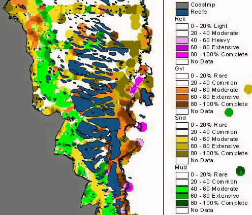
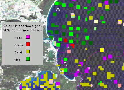
This type of visualization is a very effective method of outlining the principal textural zones across a region.

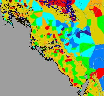
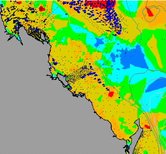
Griddings of Rock, Gravel, Sand, Mud are generated from the ALL file and imported into ArcView as separated themes with (*.avl) legends "rck_gd", "gvl_gd", "snd_gd" and "mud_gd" applied. In dbSEABED there is a convention to display rock, gravel, sand and mud as purple, red, yellow and green hues respectively.

To generate grids, use the Query tool of Arcview to select against -99" (the dbSEABED "No Data Value") for the parameter concerned. Then use:
Analyse/Surface/GridExtent=[template]/OutputGridCellSize[0.1deg]/<OK> /IDW/ZValueField=[Parameter]/FizedRadius/ Radius=[10km]/Power=[2]/Barriers=[NoBarriers]/<OK>
to generate this particular type of grid coverage. Many other grid types can be used with a dominance type of legend.

Slight areas of masking may occur between themes, so different orderings of the themes may result in slightly different maps.


In this variant of a Dominance Grid, grid cell sizes happen to be set to less than the typical spacing of the data points - here 1km with points spaced at about 4km. One virtue of this display is that it does show to users where more data needs to be collected - where the blindspots are on a map.

The display here is a dominance display such as in a map above. purple - rock, red - gravel, yellow - sand, green - mud. Thus, for gravel: dark red represents >80% gravel, intense red represents >60% gravel, pink >40%; values; <40% are not shown. Some polygons of rock areas have also been added, as has Landsat imagery of the land nearby.

Top of page


Return to Visualizations
Return to db9 Manual


Chris Jenkins (Email)
INSTAAR, University of Colorado
5-Feb-2002