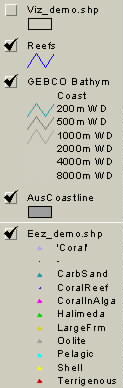
are superimposed on those from word-based data (PRS file).
Both files are themes in an Arcview view.
|
|
Contents
| Point
Distribution
Hydrographic Code Plots Point Seafloor Classification Facies Membership Tables |
However, point mappings are very useful for
Here are some examples.
|
Here, data points based simple extraction from existing data (contents
of EXT file),
are superimposed on those from word-based data (PRS file). Both files are themes in an Arcview view. |
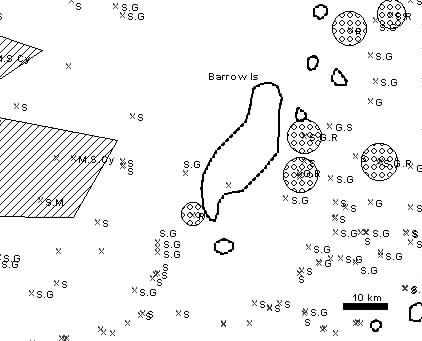 |
Hydrographic (NIMA) Codes can be displayed as ArcView labels next to
displayed points. However, if this is done from ALL, there may be several
codes per point, with a problem for readability. Use just one of EXT
(echoed codes), PRS (grain types and textures from descriptions),
or CLC (calculated from texture only; as in figure) at a time. Arcview
can set to "Permit (or not) overlapping codes, in which case only the first
to be plotted of the overlappings will be written.
The codes can be displayed over other themes such as colourized texture, or (as in this case) can be augmented with drawn sediment-type boundaries. |
 |
 |
A column ('SeafloorCl'...ass) in the output tables PRS and ALL
provides a fuzzy membership assessment of the dominant sediment facies
/ biofacies represented at each point where sufficient word-based description
is provided. The subsequent column ('Classmshp') also provides the level
of membership.
After the relevant table is loaded, the points can be colour-coded by
facies in ArcView as follows:
Similar but more comprehensive plots of seafloor facies and classes can be made from the FAC and CMP file tables (see below). |
 |
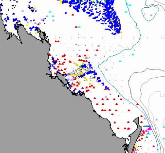
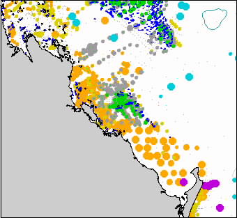
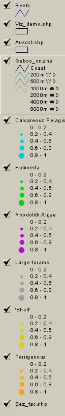
The most effective way to visualize seabed facies is with multiple
copies of the table FAC as themes, each classified using a different
column in the table, for instance, "Calcareous Pelagic". Fuzzy memberships
for each site to that facies are rendered by increasing size of symbol,
here in 20% classes with the 0-20% interval hardly shown (just a dot).
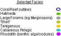
This allows points with mixed facies to be seen as mixed (concentric dots) - especially if the symbols are made in outline only (not here). Minor changes from the map result with a differnt ordering of the themes. Of course, facies information is shown only for the sites where adequate descriptive information is available. The detailed legend for this map can be seen here. A simpler one can be made in a graphics application such as Canvas(R) or Corel(R) is shown below. Note that the Halimeda is mostly on the reefs but that Large Forams (such as Marginopora) extend into surrounding waters. The same type of map can be made for Grain/Feature memberships reported in the output table CMP.
|
![]()
Chris Jenkins (Email)
INSTAAR, University of Colorado
5-Feb-2002